
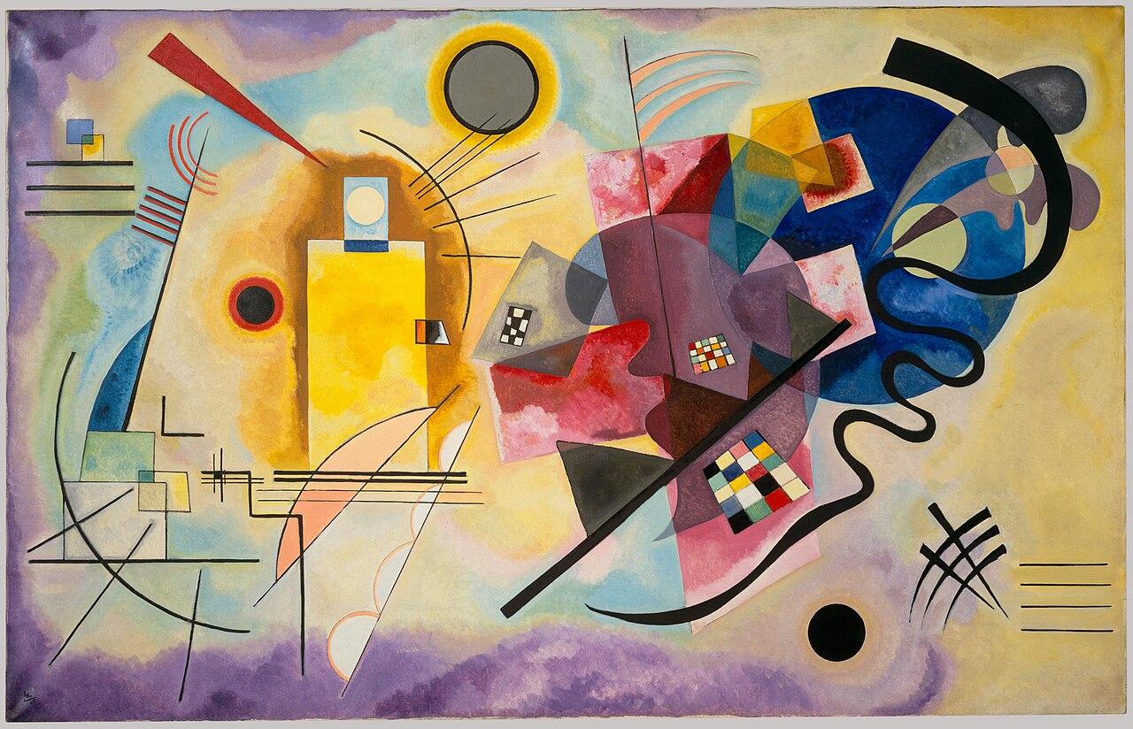

An abstract composition for a room where the picture sets the tone. We consider its visual balance and the questions raised by translating it into a commercial canvas.
The original artwork
The Centre Pompidou dates Kandinsky’s Yellow-Red-Blue to 1925 and records the original as oil on canvas. Its entry places the work in his Bauhaus period.
Source [2]
Where we would try it
We would try it in a study or living room with straightforward furniture lines. Its curves, straight lines and colour masses do not need more geometric decoration immediately beside them. Breathing room can help it read as a composition rather than another fragment of an overcrowded wall.
How to pair it
We would not distribute yellow, red and blue equally throughout the room. Pick one as a secondary accent and leave the others in the painting. A neutral seat and a small blue object might be enough. This is a styling proposal, not a rule or a claim about the actual colour of this print.
The checked reproduction
The cuadrosfamosos.es listing checked identifies a 95 × 70 cm canvas reproduction with a 3 cm wooden stretcher and printed sides. We have not verified these characteristics on a physical unit.
Seller information [1]
What to check
Before buying, ask for a complete straight-on image to inspect the circles and the lines approaching the edge. Changes in proportions can alter the sense of balance, but we are not claiming this option is distorted. The 95 × 70 cm label alone does not explain the front image area, any margins or the treatment of the sides.
- Confirm the option and outer dimensions before buying; do not extrapolate specifications to other sizes.
- Try a paper template on the wall and look from your usual viewing position.
- Check the seller, package contents and current terms directly on Amazon.es.
How to test the size before buying
Our reading
We would choose this visual direction when seeking energy without a recognisable figure. If you need the picture to remain almost unnoticed, explore a lower-contrast image. Test the dimensions with paper and look from a normal viewing distance: a compelling thumbnail does not ensure the same balance will work above your furniture.
Paper, canvas and framing: what changes
About this guide
Our selection brings together artwork sources, seller information and decorating advice.
How we put this guide together
Documentary profile, without purchase or hands-on testing. The image shows the original artwork, not the Amazon product. We do not assess print quality, colour, mounting or durability.
Our editorial methodSources
- Amazon.es — cuadrosfamosos.es / B07431JJQ3Amazon.es · merchant listing ·
- Yellow-Red-Blue — collection recordCentre Pompidou ·